- Using Common Form Fields - Marketing Details
- Using Ad-Hoc fields
- Configuring the Form
- Preview Your Form
Drag and Drop Components
This guide will walk you through the basic steps on how to use the Drag and Drop Components in the Form Builder.
The Drag and Drop components are fields that are used in the form - these components allow you to easily add, arrange, and configure form fields without writing code.
STEP-BY-STEP
-
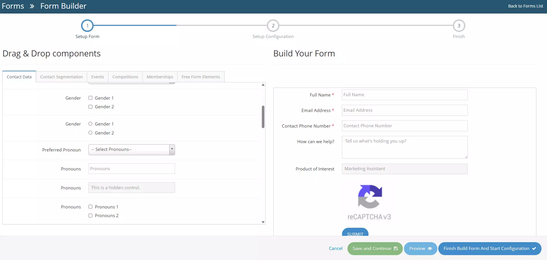
1When creating or editing a form, the user will be redirected to the Form Builder
-
2There are two (2) sections - the Build Your Form and the Drag and Drop Components, in this guide, you will learn the basics and necessary steps in using the Drag and Drop Components.
-
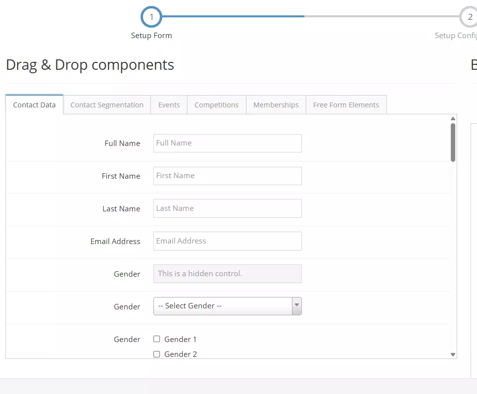
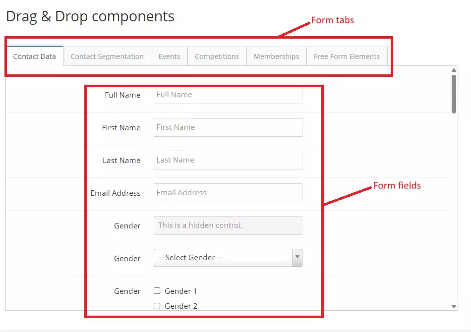
3As shown below - there are tabs which is called Form Tabs, and each tabs consist of Form fields that are used when creating a form.
- Form Tabs - are located at the top of the Drag & Drop interface. They group related fields into categories, making it easier to find and add the correct information to your form.
- Form Fields - appear below the tabs and represent the individual inputs that can be added to your form.
-
4There's six(6) Form Tabs.
- Contact Data - this tab contains fields for basic contact information, such as full name, first and last name, email address, phone number, mobile number, etc.
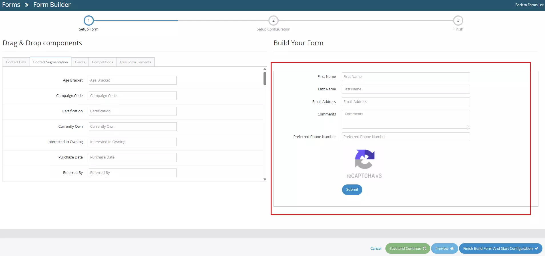
- Contact Segmentation - this tab contains fields that are used when filtering or grouping contacts - to know more, learn how to use advanced search → .
- Events - this tab contains event-related fields, Learn how to use events →.
- Competitions - this tab contains competition-specific fields
- Memberships - this tab, as the name says, contains membership-specific fields, Learn how to use memberships →.
- Free Form Elements - this tab contains fields that can be customised based on your input. This tab also contains non-data elements, such as text or headings, images, page breaks, and lines.
-
5Now, to create your form, select the appropriate Form Tab. You can start by dragging fields into the form layout area or the Build Your Form section.
-
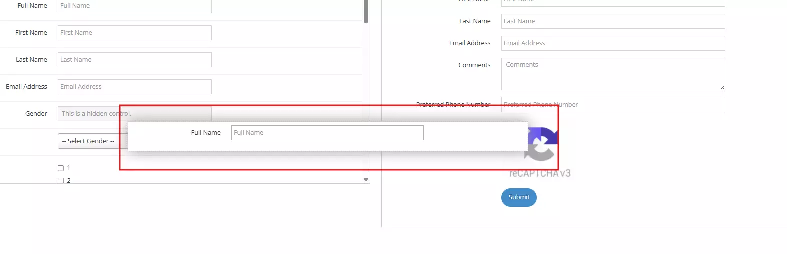
6Now, to add new fields or components, simply select by clicking and holding a component in the Drag and Drop Component section and dragging the component across the Build Your Form section
-
7Once you're satisfied with the form you've created, you can Save and Continue, Preview or Finish Build Form and Start Configuration. The buttons are located in the lower-right section
- Cancel - cancel changes, user will be redirected to the Forms Management page.
- Save and Continue - saves the changes made, user will stay in the Form Builder page.
- Preview - redirects to the Form Preview page.
- Finish Build Form and Start Configuration - User will be redirected to the form configuration page. Learn how to configure your form here →
