Form Builder Overview
- Form Builder provides the ability for users to quickly create forms on the fly and embed them into any website.
- The form builder contains multiple predefined types of a component such as input, button, image, drop-down... and so on.
In this guide, we will demonstrate adding a custom control.
Form Builder Architecture
The form components are controlled by the Config.xml in {Solution Folder}\Web\Control\Config.XML
The XML format allows you to define
- Title - the name of the control
- Type - allowed types are:
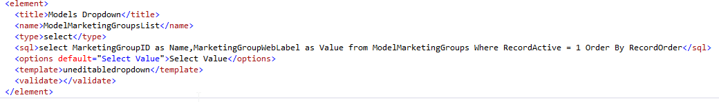
Models Dropdown
STEP-BY-STEP
-
1You can find the LIC file in WebEd.Web\Copy2Bin
-
2Locate the section "Components" we will find all components
-
3The format is:
- Title - what do you want the control called in the UI
- Name - how we can call it in code or ID
- Type - Valid types are:
- button
- checkbox
- checkgroup
- heading
- hidden
- img
- normaltext
- radiobutton
- radiogroup
- select
- textarea
- textbox
- SQL - the SQL statement to build the control values (only relevant for radio and listbox)
- Template - the template to use for the UI, use an existing one and check the result.
- Generally, Listbox and Radio will use this
- Validate - is this a required value by default