What is an iFrame
An iFrame (Inline Frame) is an HTML element used to embed another HTML document within the current page. It allows you to display content from external sources, such as videos, maps, or other websites, directly within your page. This can be especially useful for integrating third-party services like YouTube videos or Google Maps without having to redirect users to another page.
The iFrame tag supports attributes like "src" for the URL of the content to be embedded, "width" and "height" for defining its size, and "frameborder" for adjusting the border visibility. It also offers flexibility to adjust the embedded content’s responsiveness, which makes it adaptable to different screen sizes.
Why you would use a Responsive iFrame
A responsive iFrame allows embedded content, such as videos, maps, or forms, to automatically adjust to different screen sizes, improving user experience on both mobile and desktop devices. By using responsive CSS techniques, the embedded iFrame maintains the correct aspect ratio while scaling its size to fit various viewports. This ensures that the content remains usable and visually appropriate across all devices, whether it be a smartphone, tablet, or desktop.
Example of a Responsive iFrame
Please see the Youtube iFrame on this page: https://www.interactivepartners.com.au/WebEd-Editing-Basics which can stay in proportion even you try to resize the window.
How to Insert A Responsive iFrame
Steps to Insert the iFrame
-
1
Please follow Editing Pages to open the page editor
-
2
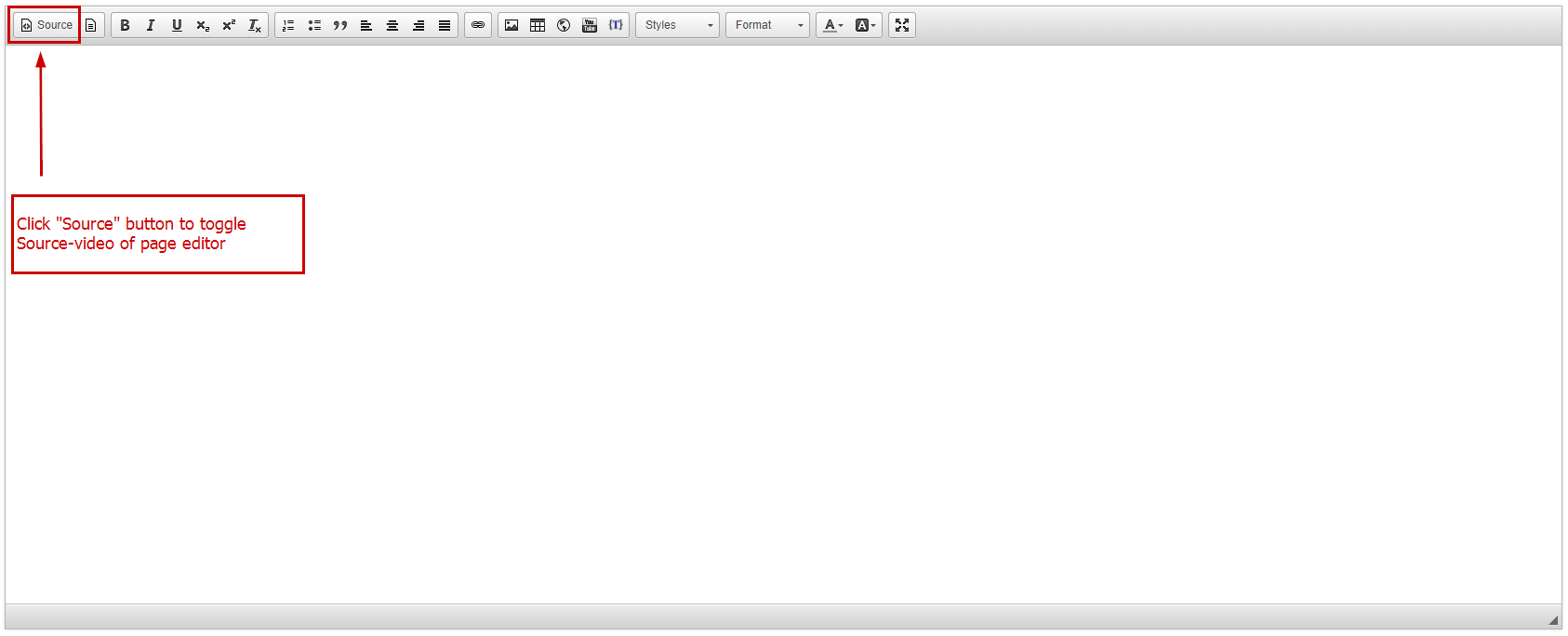
Click the "Source" button to toggle the Source video of the page editor

How Determine the Aspect Ratio
Understanding Image Aspect Ratios
Aspect ratio is the proportional relationship between an image's width and height. It’s expressed as a ratio, like 4:3 or 16:9, where the first number represents width and the second represents height. Choosing the correct aspect ratio is essential for maintaining visual consistency and optimising how images appear across different devices and layouts.
Common Image Aspect Ratios:
- 1:1 (Square): Often used for profile pictures or icons.
- 4:3: Standard for many cameras; ideal for general photos and online galleries.
- 16:9: Common for videos and widescreen formats.
- 3:2: Standard for digital SLR photography; maintains a classic photographic look.
Why Aspect Ratio Matters
Maintaining the correct aspect ratio helps avoid image distortion. For instance, a stretched or compressed photo may detract from the visual quality and impact on viewers. Proper ratios ensure images are displayed as intended, preserving both aesthetics and functionality on responsive web designs.
- Determine the aspect ratio of your video
- Most YouTube videos are 16x9
- We support responsive for the following ratios: 16x9, 4x3, and 19x16.
- If you like to have another ratio, please contact us at: [email protected]
Insert DIV wrapper prefix
-
1
Copy and paste the DIV for your iFrame aspect ration
- 16x9 < div class="container-iframe container-iframe-16x9" > (most common)
- 19x16 < div class="container-iframe container-iframe-19x16" >
- 4x3 < div class="container-iframe container-iframe-4x3" >
-
2
Immediately after this, paste your iFrame code
-
3
Then insert the closing DIV < /div >
-
4
The code should appear similar to this
< div class="container-iframe container-iframe-16x9" > < iframe width="XXX" height="YYY" src="https://www.youtube.com/embed/.... >< /iframe >< /div >
-
5
Click the Source button to switch back to design mode
-
6
Click Save to save the content.
-
7
The code should appear similar to this
< div class="container-iframe container-iframe-16x9" > < iframe width="XXX" height="YYY" src="https://www.youtube.com/embed/.... >< /iframe >< /div >
If you have applied this to your iFrame, but it is still not working as expected, please contact us at [email protected]
How to update iFrame on the page
-
1
Go to the desired page
-
2
Edit the page
-
3
Double-click the iFrame

-
4
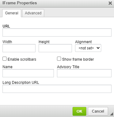
iFrame properties will pop up
- General
- URL - this is the iFrame URL
- Width - this will be iFrame width
- Height - this will be iFrame height
- Alignment - this will be iFrame alignment
- Enable scrollbars - if this is ticked, it will enable scrollbars for the iFrame
- Show frame border - if this is ticked, it will enable scrollbars for the iFrame
- Name - this will be the iFrame name
- Advisory Title - this will be the title of the iFrame
- Long Description URL - this will be the description of the iFrame
- Advanced
- ID - you can set anchor ID here
- Style - you can set the iFrame styling here
- Stylesheet Classes - you can set iFrame style class here

- General
-
5
Update the fields accordingly
-
6
Click OK
-
7
Click Save and Close