This guide will walk you through the basic steps on how to use the Form Field Properties in the Form Builder.
STEP-BY-STEP
-
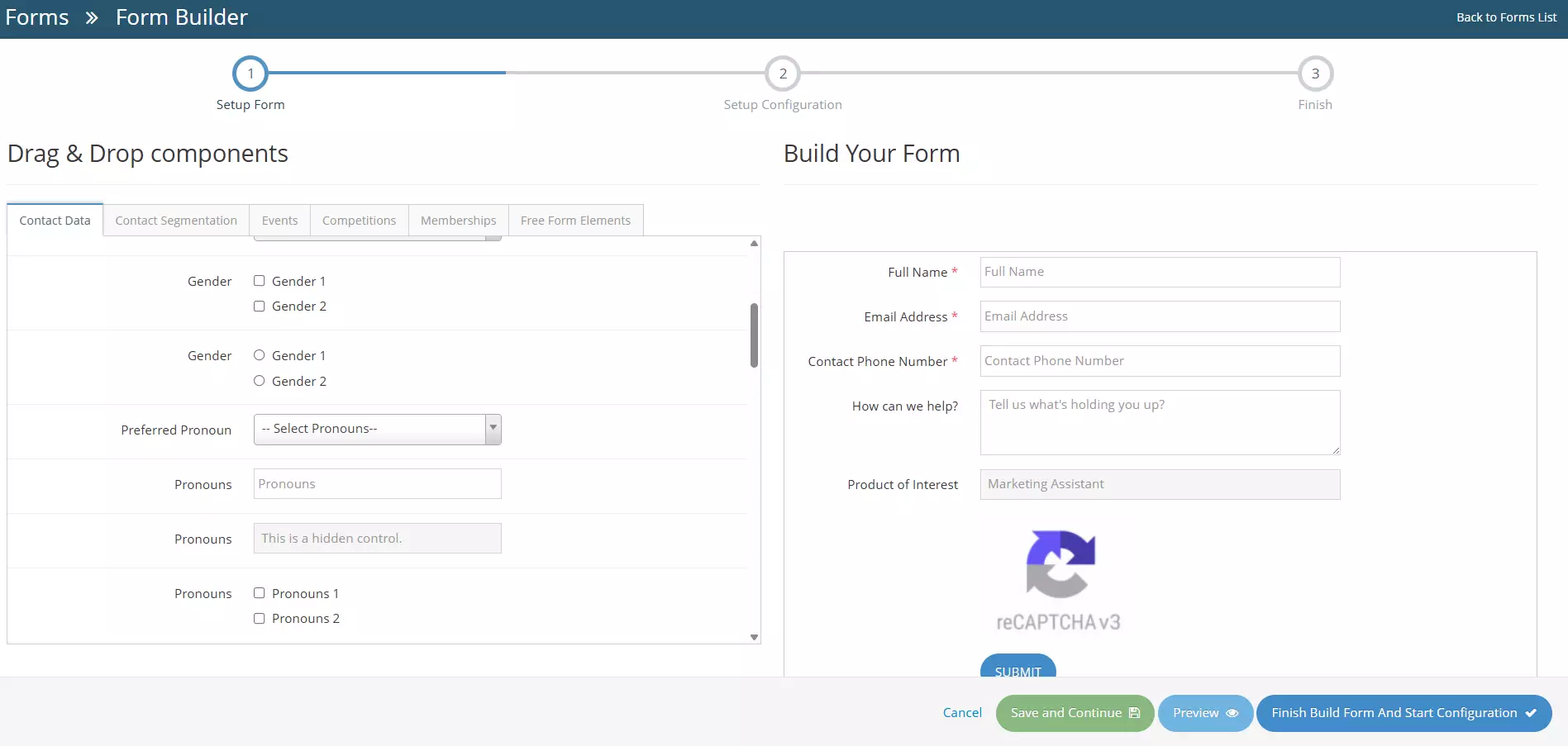
1When creating or editing a form, the user will be redirected to the Form Builder
-
2On the Build Your Form section, there are fields as shown below, By clicking, you can see the properties of those fields (for example, Full Name) to open its Field Properties panel on the left side of the screen..
-
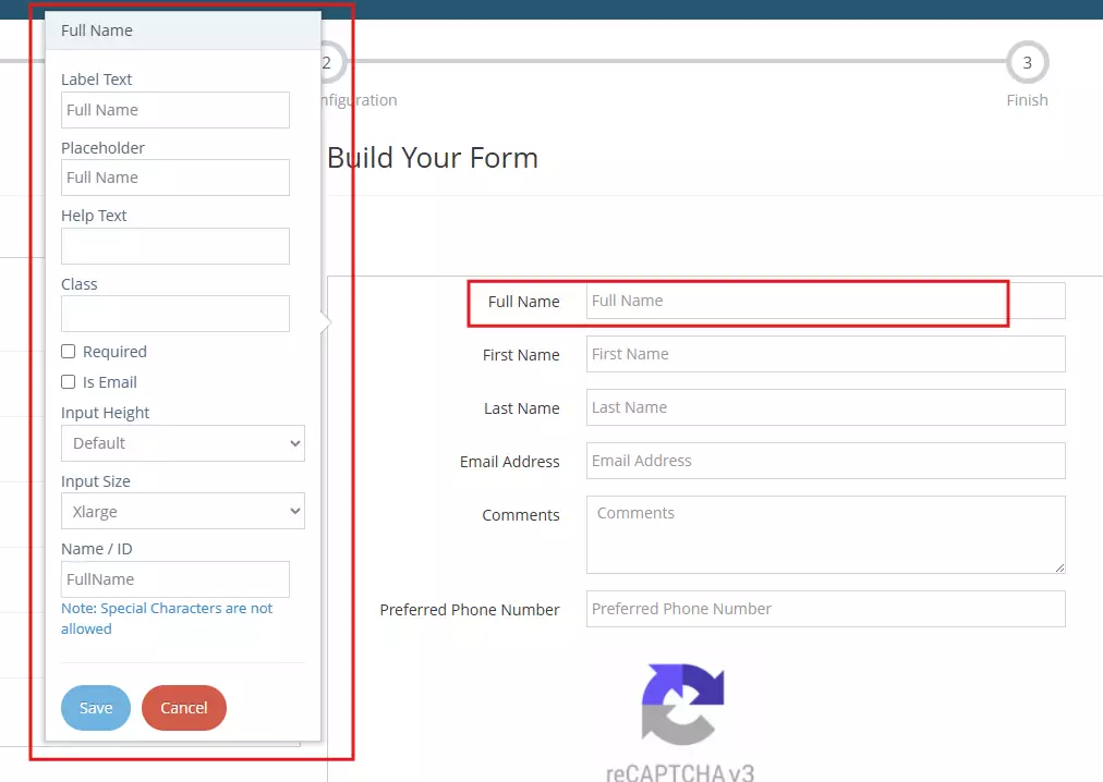
3Update the field settings as required:
- Label Text – Enter the text that will be displayed as the field label.
- Placeholder – Specify the placeholder text that will appear inside the input box before a user enters information.
- Help Text – Add additional instructions or guidance for users completing the field.
- Class – Enter a custom CSS class if additional styling is required.
- Required – Select this option to make the field mandatory.
- Is Email – Select this option if the field should validate email addresses.
- Input Height – Choose the desired height for the input field.
- Input Size – Select the width or size of the input field.
- Name / ID – Specify a unique identifier for the field. Special characters are not permitted.
-
4After making your changes, click Save to apply the updates to the selected field.
-
5Repeat the process for any additional fields that require configuration.
-
6Once you're satisfied with the form you've created, you can Save and Continue, Preview or Finish Build Form and Start Configuration. The buttons are located in the lower-right section
- Cancel - cancel changes, user will be redirected to the Forms Management page.
- Save and Continue - saves the changes made, user will stay in the Form Builder page.
- Preview - redirects to the Form Preview page.
- Finish Build Form and Start Configuration - User will be redirected to the form configuration page. Learn how to configure your form here →
